Comparisons
PR Lens vs ToDiagram and other diff-to-diagram tools
ToDiagram turns structured data into diagrams you can explore, and its skill will draw a pull request too. Here is where that differs from a render posted inside the pull request itself.

ToDiagram and PR Lens start from different problems. ToDiagram is a data visualiser: its own tagline is "Turn your data into diagrams you can read", and its homepage offers to turn "JSON / YAML / XML / CSV / Mermaid / anything" into diagrams. A post on its blog dated 17 March 2026 extends that to pull requests through an agent skill you install with npx skills add todiagram/skills. PR Lens starts at the other end: one input, a pull request, and one destination, a comment inside it. ToDiagram is a viewer you take the change to; PR Lens is a diagram that arrives where the change already is.
Both are worth having on a machine. They are not the same tool, and the differences are practical ones.
What ToDiagram is
ToDiagram accepts JSON, YAML, XML, CSV, JSON Schema, Mermaid, and custom nodes and edges, and turns them into an interactive diagram you can search, theme, edit and share. Its feature list, in its own words, includes searching for "any node in a 10,000-line payload", one-click public links, visual editing where "Edit your data or your diagram. Both stay in sync", and an MCP server under the heading "Give your agent eyes for data".
The privacy line is the one I would highlight if I were them: "Your data stays in your browser." For a tool people paste production payloads into, that is the property that decides whether it gets used at work.
Its pricing page, as of September 2026, shows one plan, and it is free: creating and editing diagrams, storing and sharing up to three of them, basic PNG and JPEG export, and API and MCP access.
How its pull request workflow works
The March 2026 post lays out three steps: give the LLM the pull request diff, ask it to explain the change visually, and render the result as a diagram. The skill installs into a coding agent, and the model decides which kind of diagram fits rather than filling in a fixed template. The post lists architecture diagrams, module graphs, data models, flow diagrams and sequence-like flows as the shapes it might reach for, and the worked example links out to an editor URL where the diagram lives.
What it does not describe is a comment on the pull request. The diagram is generated in your agent session and viewed on ToDiagram.
That is a coherent design. It also means the artefact and the pull request are two different places, and keeping them in step is somebody's job.
What ToDiagram does well
Breadth. It will draw your API response, your Terraform state, your config file and your pull request, all with the same navigation, and searching a huge payload for one node is a genuinely useful thing that no diagram-in-a-comment can do.
Letting the model choose the diagram type is also defensible. Some changes really are a sequence, some are a data model, and a tool with no opinion about which one you need will occasionally produce a better picture than a tool with a fixed grammar.
And the free plan is enough to try the whole idea, which is more than most of this category offers.
Where PR Lens is built differently
Four decisions separate them, and each one is a trade.
The model never picks the picture. It writes a typed JSON graph document: kind, lenses, lanes, and nodes carrying an id, label, kind, delta and lane. A schema validates that document, and a renderer with no dependencies beyond the schema draws it. Text is measured against an embedded table rather than a font engine, so a CI runner with no fonts installed produces the same bytes as my laptop. The cost is that PR Lens will only ever draw two lenses, architecture and data flow. The benefit is that the same change drawn twice looks the same twice, and a reviewer learns one visual grammar instead of whatever the model felt like today. That argument in full is in why the model should describe the graph and never draw it.
Colour carries the delta. Green is new, amber is changed, red is gone, and a removed component is struck through instead of deleted, so you can see what left. The parts of the system the change did not touch stay on the page. A general purpose diagram of a diff has no notion of what the change did to each node, because the model is drawing a system rather than a change to one.
It posts into GitHub. Exactly one comment per pull request, rewritten in place on every push, identified by a hidden HTML marker so it only ever adopts its own comment. An older analysis that finishes late is discarded. The output is SVG with SMIL animation and no JavaScript in it, which is why the data flow still moves inside a GitHub comment where scripts are stripped, and the rendered files sit at content-hashed keys because GitHub's image proxy caches a URL forever.
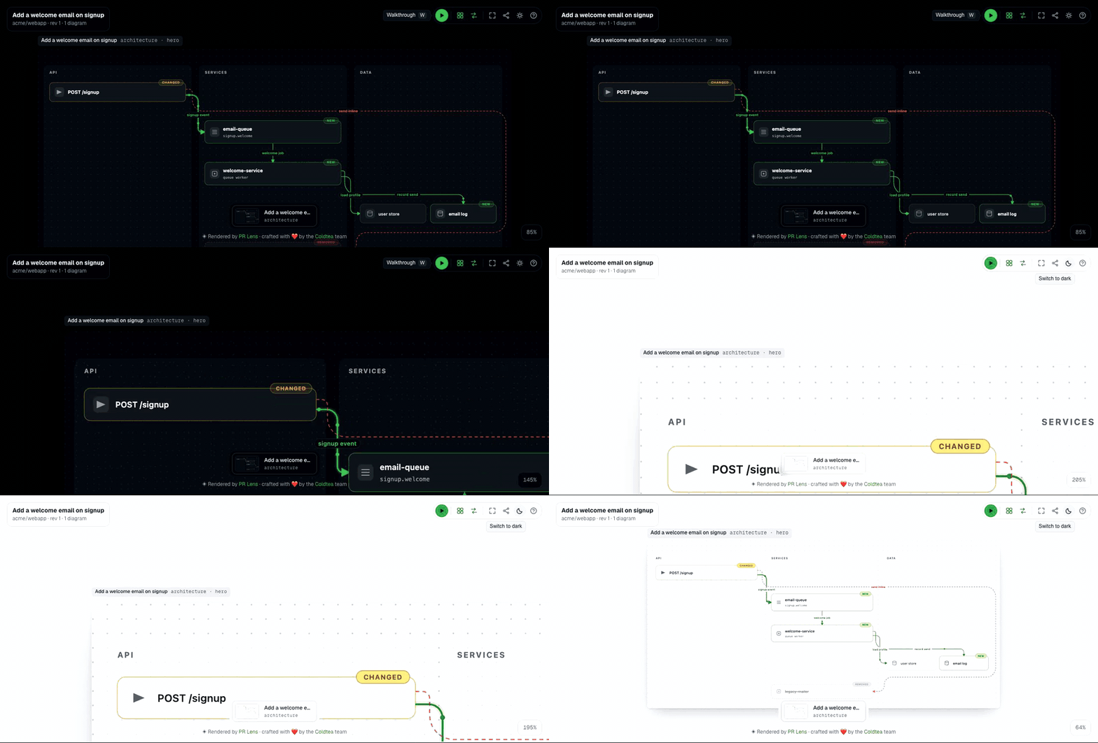
And there is a canvas. Every comment links to the same diagrams at full size with pan, zoom and a light or dark theme, and pressing play there walks the change one step at a time: everything else dims, the cards and routes for that step light up, and one line says what happened there.
PR Lens is MIT licensed at github.com/coldteadotai/pr-lens and free for open source. The hosted GitHub App needs no model key of yours. There is also a GitHub Action that takes your key, a CLI on npm, and an agent skill, which is the route closest to how ToDiagram's skill works: npx skills add coldteadotai/pr-lens, then ask the agent to draw the change it just made.
Other ways to get a diagram of a diff
If you widen the question from ToDiagram to every way of getting a picture of a diff, the field is smaller than it looks.
You can write Mermaid by hand in the pull request description. GitHub renders it natively in issues, discussions, pull requests, wikis and Markdown files, so this costs nothing and works everywhere. It is also written once, from memory, by the one person on the pull request who already understands the change.
You can install one of the MIT-licensed agent skills that write that Mermaid for you from the diff. Those are a real improvement on typing it yourself, and the output is still a static block in the description. Both routes get a longer treatment in PR Lens vs writing a Mermaid diagram in the PR description yourself.
You can use ToDiagram's skill, and get a diagram of whatever type the model judged best, in an editor you can explore.
The one product that did exactly what PR Lens does is gone. CodeSee posted a Review Map as a comment on your pull request, and its documentation still says "the codesee-maps bot will automatically comment on your pull request with an image of a Review Map". GitKraken announced the acquisition in May 2024, the codesee.io marketing site now returns 404 while the docs subdomain is still up, and the map action's repository has been archived since July 2023. Old comments still show their images while the interactive links behind them go nowhere, which is its own argument for a diagram that renders as a plain SVG.
Or you can have the diagram posted into the pull request and redrawn on every push. The five routes, ranked, are in how to visualise a pull request as a diagram.
Which one I would reach for
If the thing you need to understand is data, ToDiagram, without hesitation. Nothing in PR Lens will help you find one node in a 10,000-line payload, and it does not try to.
If the thing you need to understand is a pull request, and specifically a pull request somebody else has to review, the properties that matter are that the diagram arrives without being asked for, that it is still correct after the next push, and that it says what the change did rather than what the system looks like. Those are the three things a comment posted by a bot can do and a link to an editor cannot.
The wider map of where all these tools sit, finders and commenters and explainers, is in AI code review tools grouped by what they actually do. ToDiagram and PR Lens are in the same column of that table, which is rarer than you would think.
Questions people ask
What is ToDiagram?
- ToDiagram is a data visualiser. Its own tagline is "Turn your data into diagrams you can read", and it transforms JSON, CSV, YAML, XML, JSON Schema and Mermaid into interactive diagrams you can search, edit, theme and share. It also has an MCP server so a coding agent can drive it.
Can ToDiagram diagram a pull request?
- Yes, through an agent skill. A ToDiagram post dated 17 March 2026 describes installing it with npx skills add todiagram/skills, giving the model the pull request diff, asking it to explain the change visually, and rendering the result. The model chooses the diagram type. The post does not describe posting the diagram back to the pull request as a comment.
How is PR Lens different from ToDiagram?
- PR Lens is built for one input and one destination. The model writes a typed graph document and never picks the picture, a deterministic renderer draws it, the colour of every component says what the change did to it, and the result is posted as one comment inside the pull request and redrawn on every push.
Are there other tools that turn a diff into a diagram?
- The realistic options as of September 2026 are a Mermaid diagram you write by hand in the description, one of the MIT-licensed PR description skills that write that Mermaid for you, ToDiagram's skill, and PR Lens. Most of them share one property: the diagram is generated once and lives wherever you put it.
Sources
Keep reading
Turn it on
Add PR Lens to GitHub, GitLab or Bitbucket, and every new pull request is explained and reviewed. Or paste the prompt into the coding agent you already use